Quick News Digest
built by Lovable
Lovable
INITIAL OUTPUT
Starting prompt initial output
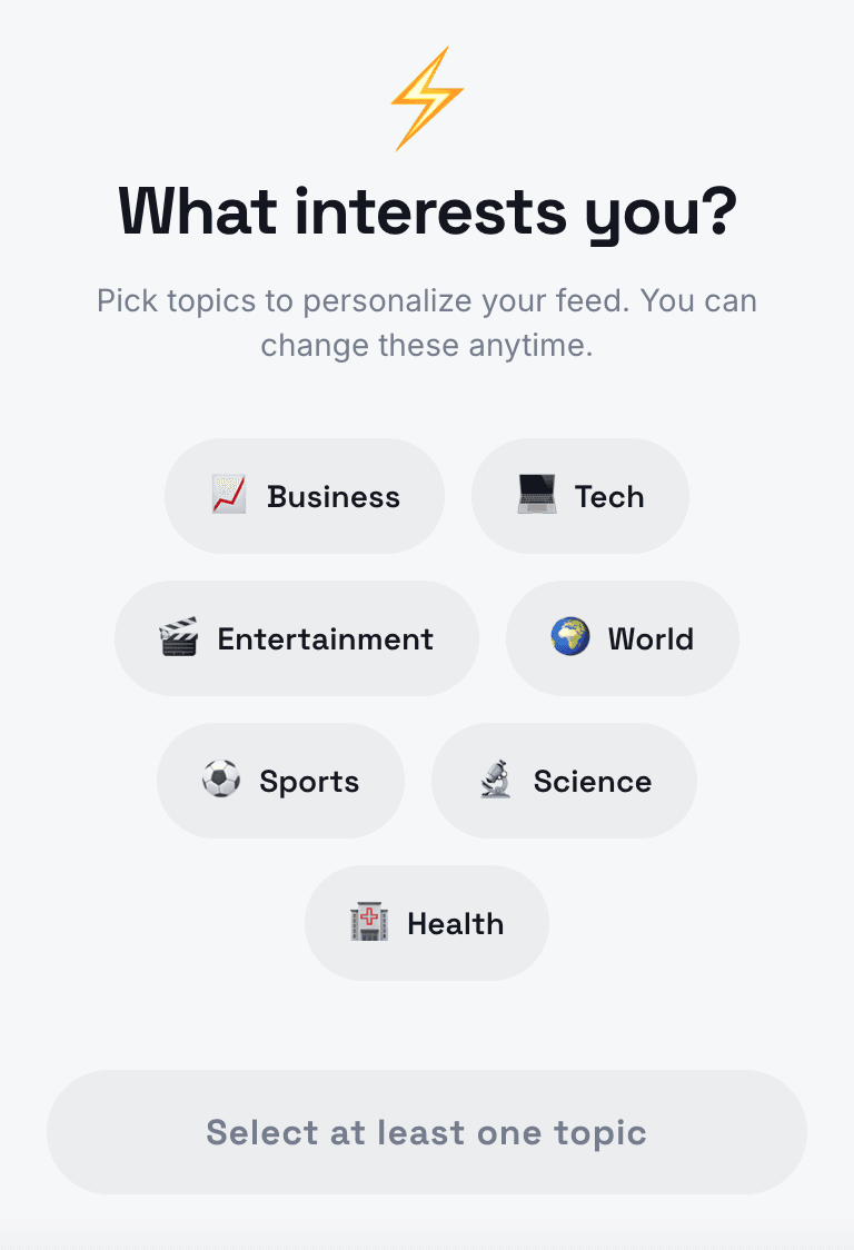
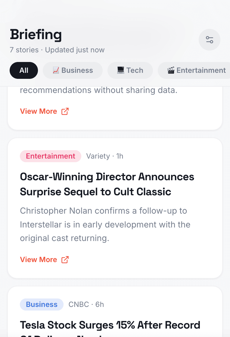
Lovable started strong with character and personality. The first screen was an interest selection page, followed by an article feed with color-coded category tags and short descriptions. Including emojis and category colors adds more fun to Lovable's creation.
PROMPTING TOWARDS THE BRIEF
From simple to feature-rich
iteration_01.txt
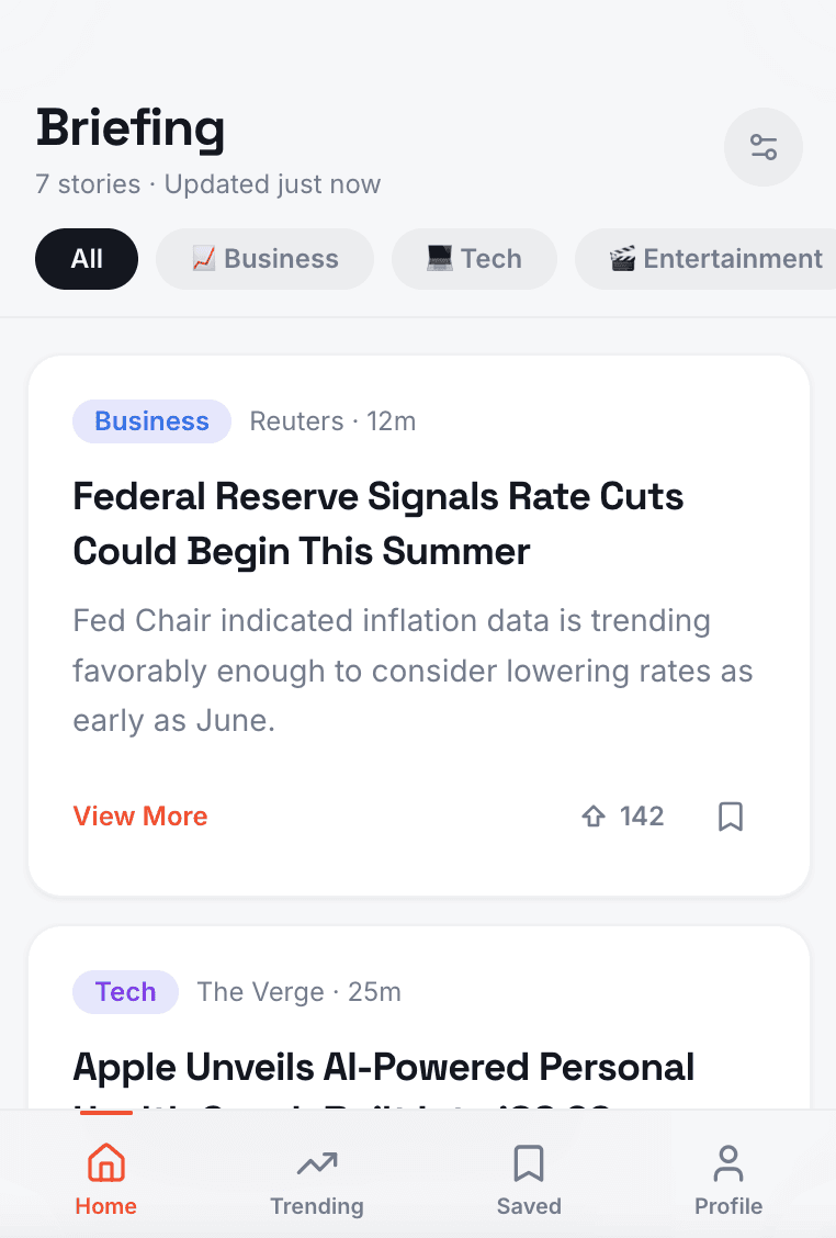
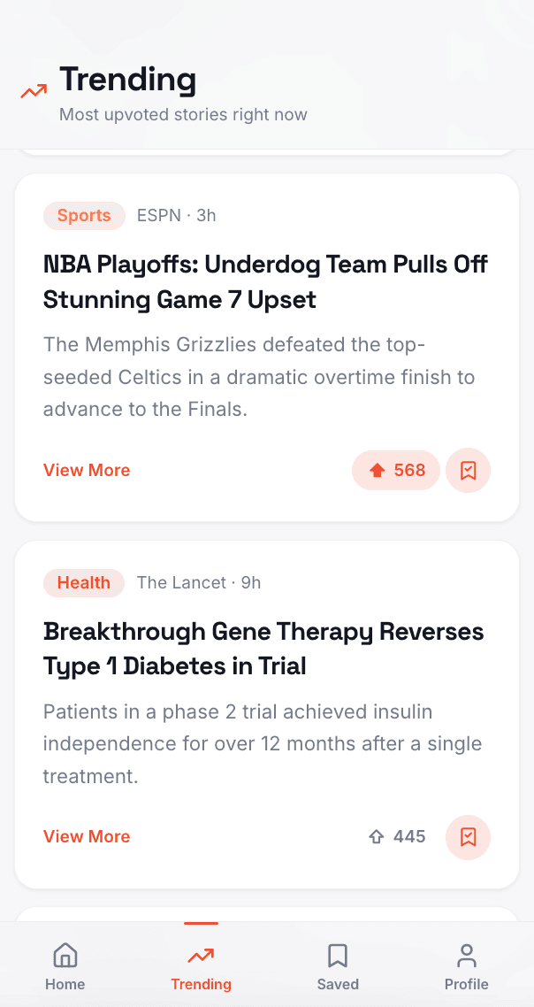
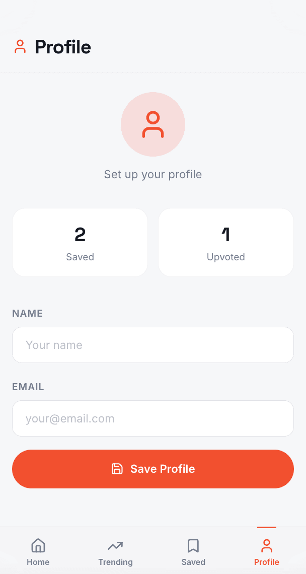
Add a navigation bar, add a profile icon for users to save their profile and somewhere to save articles they like or want to go back to read, another icon on the nav bar for trending articles, allow users to emphasize or upvote different articles that are interesting or feel that others should read, have another option for users to save articles. Instead of redirecting the user once clicking the view more option, have an overlay pop up with a summary and main idea of what the article is about. Also offer a button for quick information (i.e. political post, the button will be a shortcut to show information of who is who in the article like the president: donald trump, Vice president: JD Vance, etc)
navigation barprofile6 core screensarticle modal
iteration_02.txt
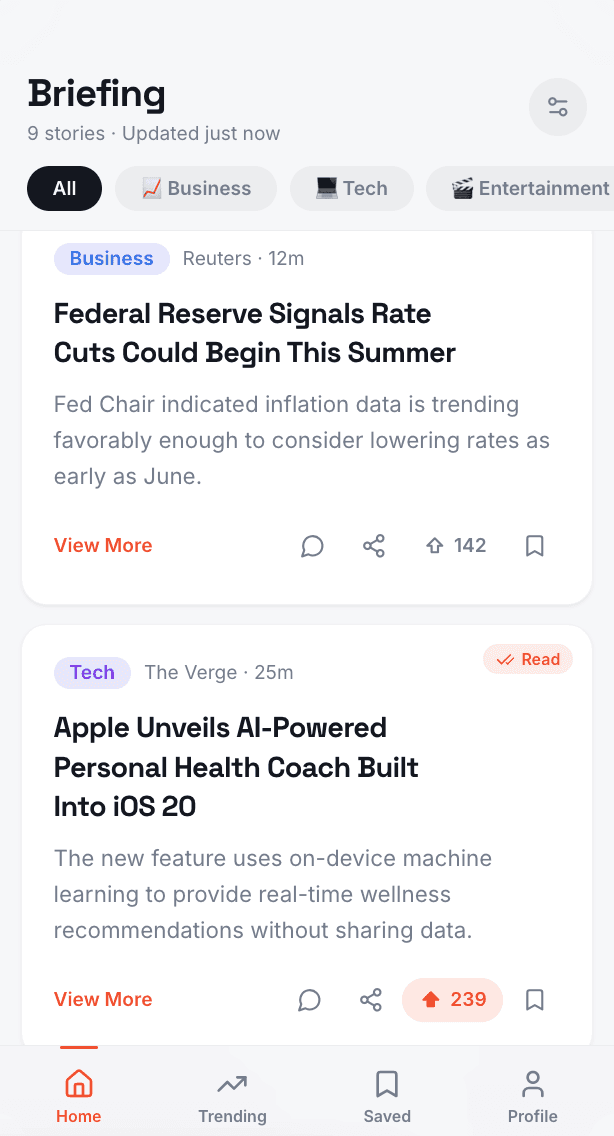
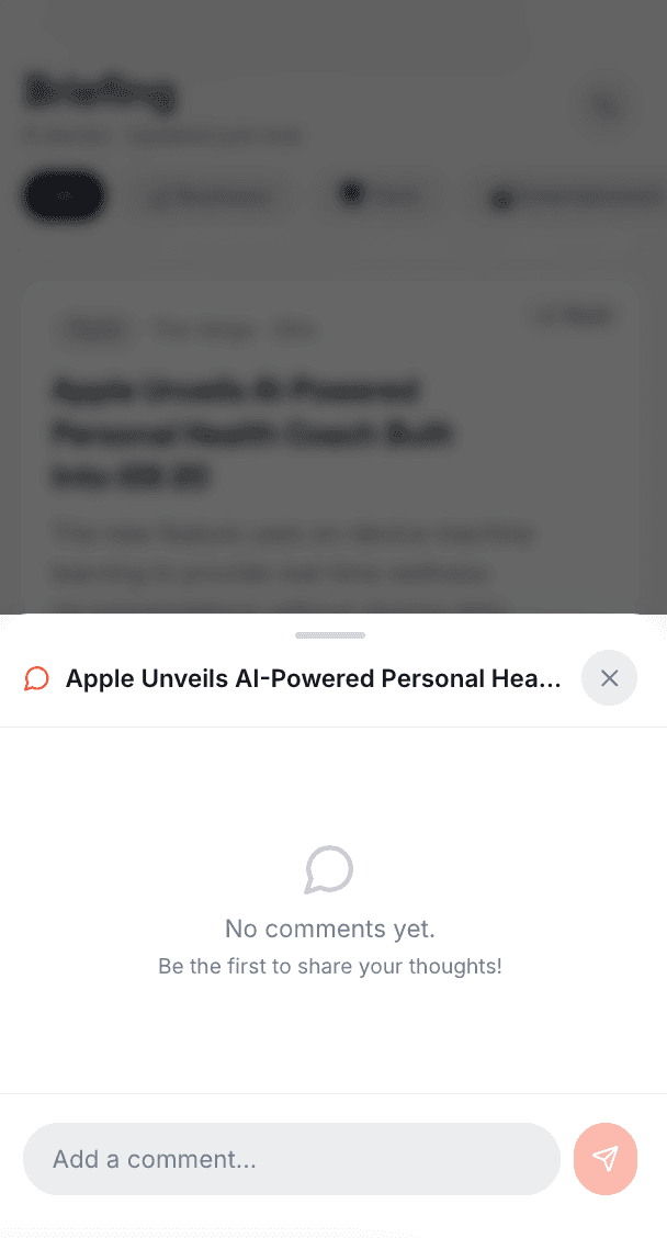
add a share option to share articles with friends, add a "read" tag on the top right corner or something to show that the user already read that article, add option on each articles for comments - can have on the summary pop up or separate option and be a completely different pop up overlay for users to read and make comments
shareread tagcomments modal
iteration_03.txt
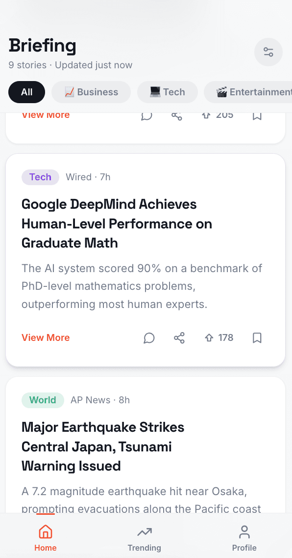
make entire card clickable to view summary modal, add an option to add / read comments on the modal page under quick info. make the article that pops up when clicking full article, open within the app and add a back arrow or a way to exit article and return to app home. can take out the saved category in the navigation bar and make the "saved" and "upvoted" buttons in the profile clickable to view the articles users saved / upvoted.
summary modalquick commentsexit pathsubtract from navigation bar

the shadowing to show the entire card is clickable

PRICING
Lovable pricing

SCORECARD
How Lovable scored
Dimension
Rating
Assessment
01
Output Quality
Named app, used colors and emojis to make it fun, overall design was minimalistic with a whimsical vibe
02
Ease of Use
Browser-based, straight forward and easy to use, can change between views easily, site is easy to navigate
03
Iteration Handling
Implemented iterations exactly as requested, did a great job adding the features and keeping UI consistent
04
Free Tier Limits
Had enough credits to write multiple prompts in a day, didn't feel restrictive, able to do a live preview in mockup
| Heuristic | Score | Notes — Lovable | |
|---|---|---|---|
| 01 | Visual consistency Does the design system hold up across screens — colors, type, spacing, and components? | ✓ Pass | Strong design language from the first output. Colors, type, and components stayed consistent across every iteration. Inlcuded fun additions, making this app version more memorable and different compared to the other AI builders. Was able to make clear iterations and adjust when pointed out or requested. |
| 02 | Navigation & wayfinding Can a user always tell where they are, how to go back, and where to go next? | ✓ Pass | Bottom nav, clear back arrows, and modal exits all implemented correctly. User always had a clear next step. All CTA and pathways made clear. |
| 03 | PRD adherence How closely did the final output match the specified features, flows, and interactions? | ✓ Pass | Implemented iterations exactly as requested. Kept features and UI consistent — no regression between prompts. Reached guidelines with ease and enacted all the features seamlessly. |
| 04 | Mobile experience Does it feel like a native mobile app? Tap targets, layout, scrolling, and transitions. | ✓ Pass | Sunshine first impression with the emojis and color. Sizing was good with enough information and interactive buttons. Color coordination made it easy to recognize categories and eye catching accent color throughout for the CTAs. |
Emergent
The BriefReturn to main page
v0
Brevity