QuickRead
made with Replit
Replit
INITIAL PROMPT
Initial Output
Replit generated a functional application with a single page of news articles and filters for only relevant categories are present.
The output prioritized the minimalistic technical structure and easy snippet information idea with limited emphasis on the user experience and potential community.

iteration_prompt_01.txt
Add a profile in the navigation for users to create their own profile so they can save articles that they want to go back to. Also add a way for users to send/share the articles they find interesting, like, and save. The likes can help boost some articles or add in the nvaigation bar somewhere that you can view the top rated articles of the week, see what people are reading. Add a button for users to click where they can leave comments about the articles and other users to read it but not having to select and scroll down the entire article to view the comment section
profileshare / send / savetrendingcomments


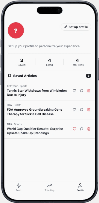
iteration_prompt_02.txt
change the like/heart to emphasize, that way it's pushed to the top for other readers to read whether the news is good or bad and not like because some people won't want to like bad news, can be like the exclamation emoji or eyes to show that people should read this article as it is important and relevent, need more awareness
emphasize


iteration_prompt_03.txt
when the user clicks on the article, instead of redirecting to the article immediately, have a box pop up or slide to another page where the user can read a summary or a breakdown of the main points of the article and then have another button where they can click to redirect them to the entire article
in app articleno redirecting

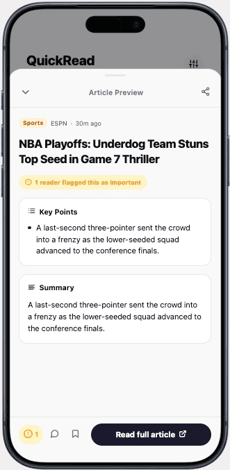
iteration_prompt_04.txt
adjust the wording of "flagged" to something more neutral, could be something similar to "upvote" or "must read", fix the links because it doesn't take users directly to the article, create some sort of signal that shows users that the article was already read by them
terminology

iteration_prompt_05.txt
have a way for users to return back to the app after opening an article, reading it, either make it a pop-up like the comments and summary or include a back button to return back to the app
exit route

select "Read Full Article"

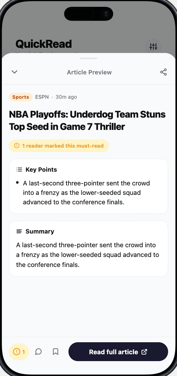
select "Read Full Article"

PRICING
Replit pricing

Dimension
Rating
Assessment
01
Output Quality
Great starting point iteration, clean and simple
02
Ease of Use
Easy to use, only hard to retrace steps and having to look for previous prompts
03
Iteration Handling
Had more iterations since slowly figuring out what features wanted to include, understood the assignment and pushed out changes very well
04
Free Tier Limits
Daily limit but can do a good amount of iterations, make use of each prompt
| Heuristic | Score | Notes — Replit | |
|---|---|---|---|
| 01 | Visual consistency Does the design system hold up across screens — colors, type, spacing, and components? | ✓ Pass | Kept consistent with strong visual design throughout pages and iterations. Used some color coordinating with tags and full color CTAs to highlight. |
| 02 | Navigation & wayfinding Can a user always tell where they are, how to go back, and where to go next? | ◑ Partial | Clear bottom navigation and steps to follow into next part. Had to focus and correct some areas when missing a return or next button. |
| 03 | PRD adherence How closely did the final output match the specified features, flows, and interactions? | — N/A | Helped create the base of what we are looking for and building towards with the other AI builders. |
| 04 | Mobile experience Does it feel like a native mobile app? Tap targets, layout, scrolling, and transitions. | ✓ Pass | Native from the start, smooth and easy from a mobile point of view. Kept concept minimal and simple for thumb-access across the board. |
Return to main page
PRD