Prompt to
Product
A designer's field test — building the same news app across 4 AI builders to find out who actually delivers on the brief
ROLE
UX Researcher
BUILDERS
Lovable, v0, Bolt, Emergent
YEAR
2026

01 - OVERVIEW
A designer's field test
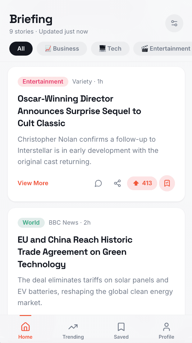
This project started as a question with no clean answer — with so many AI app builders launching at once, which one is actually worth using? Rather than reading about them, I tested them by building the same app in four different AI builders using the same starting prompt and evaluated each on output quality, design decision, iteration responsiveness, and free tier usability.
"What started as a tool comparison became something more useful: a lesson in why the design process still matters even when AI is doing the building."
02 - DISCOVERY
Jumping in blind
The moment I wrote the first iteration prompt for Lovable, something clicked. I was able to fit more features into that single prompt than I had used across multiple days of building in Replit — because Replit had already shown me exactly what to ask for.
Building blind in Replit, with just an idea and no direction, led to the discovery that a PRD was necessary. Without one, there was no way to build with intention or evaluate with consistency. That document became the foundation and direction for the rest of the project.
03 - THE BUILDERS
Meet the cohort


04 - ITERATION WALKTHROUGHS
See what each builder made



05 - SCORECARD
What they were up against
06 - RATING & THOUGHTFUL ADDITIONS
How they stacked up - overview edition
07 - TAKEAWAYS
Lessons to take onto the next project
This project taught me more about the importance of the design process than it did about AI tools.
01
Going into a builder without a design direction produced something — but reacting to what came out wasn't the same as designing with intention.
02
All AI builders are excellent at executing a clear brief and much weaker at filling in what wasn't specified.
03
The builders that produced the strongest outputs weren't necessarily the most technically capable — they made the best design decisions in the absence of explicit instructions.
04
That's a design judgment call, not an engineering one — and it's where the gap between a good builder and a great one actually lives.