trainON
trainON
Avocademy 2023
designed to help users build sustainable workout habits through guidance, motivation, and routine-building
designed to help users build sustainable workout habits through guidance, motivation, and routine-building

Problem
Problem
Studies show that 80% of people give up on their personal fitness goal within 6 to 8 weeks, reasoning stemming from no plan, loss of drive or motivation, low time, and feeling that the goal is too hard to reach.
Studies show that 80% of people give up on their personal fitness goal within 6 to 8 weeks, reasoning stemming from no plan, loss of drive or motivation, low time, and feeling that the goal is too hard to reach.
Solution
Solution
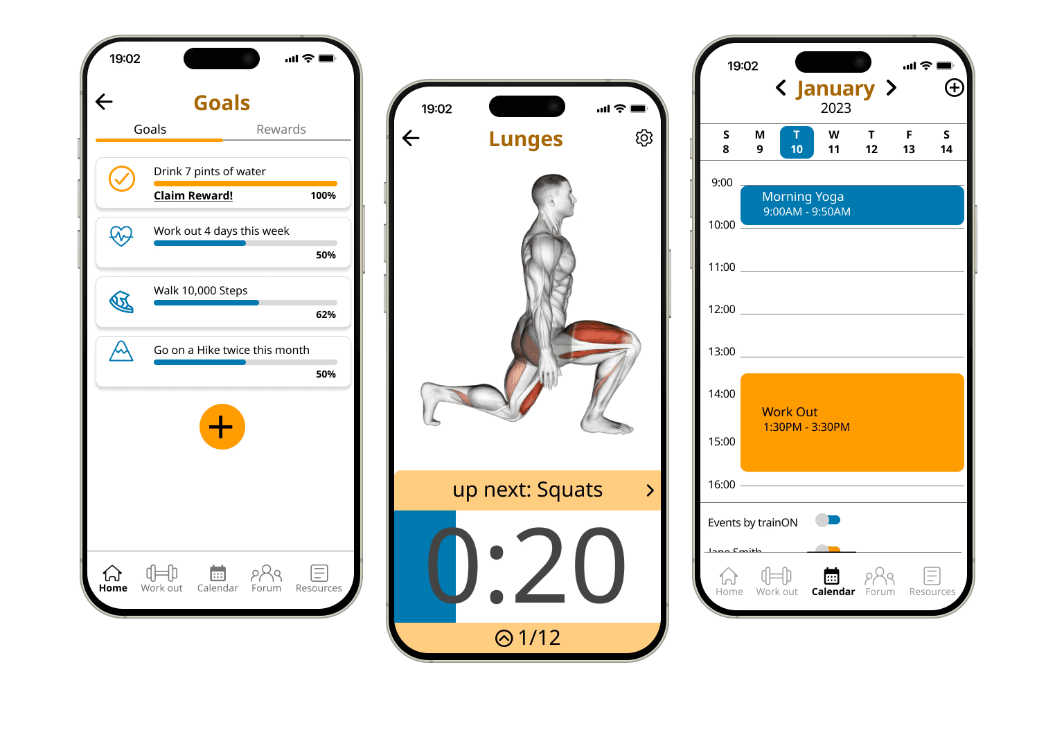
Muscle activation highlights help users understand proper form and build the mind-muscle connection that most beginners are missing. Scheduled workouts and class options create structure and accountability so consistency becomes a habit, not a chore. And small goals with lightweight rewards make the journey worth showing up for.
Muscle activation highlights help users understand proper form and build the mind-muscle connection that most beginners are missing. Scheduled workouts and class options create structure and accountability so consistency becomes a habit, not a chore. And small goals with lightweight rewards make the journey worth showing up for.
Research Findings and Analysis
Research Findings and Analysis
Secondary: hard to follow workouts, unclear form guidance, fleeting motivation systems
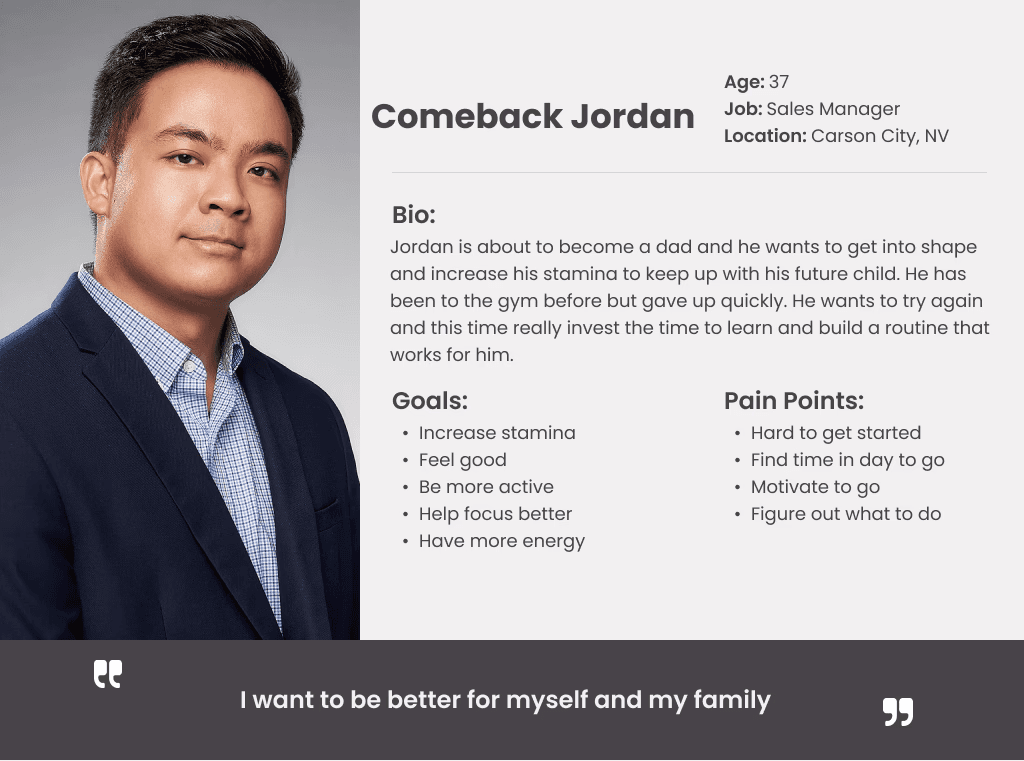
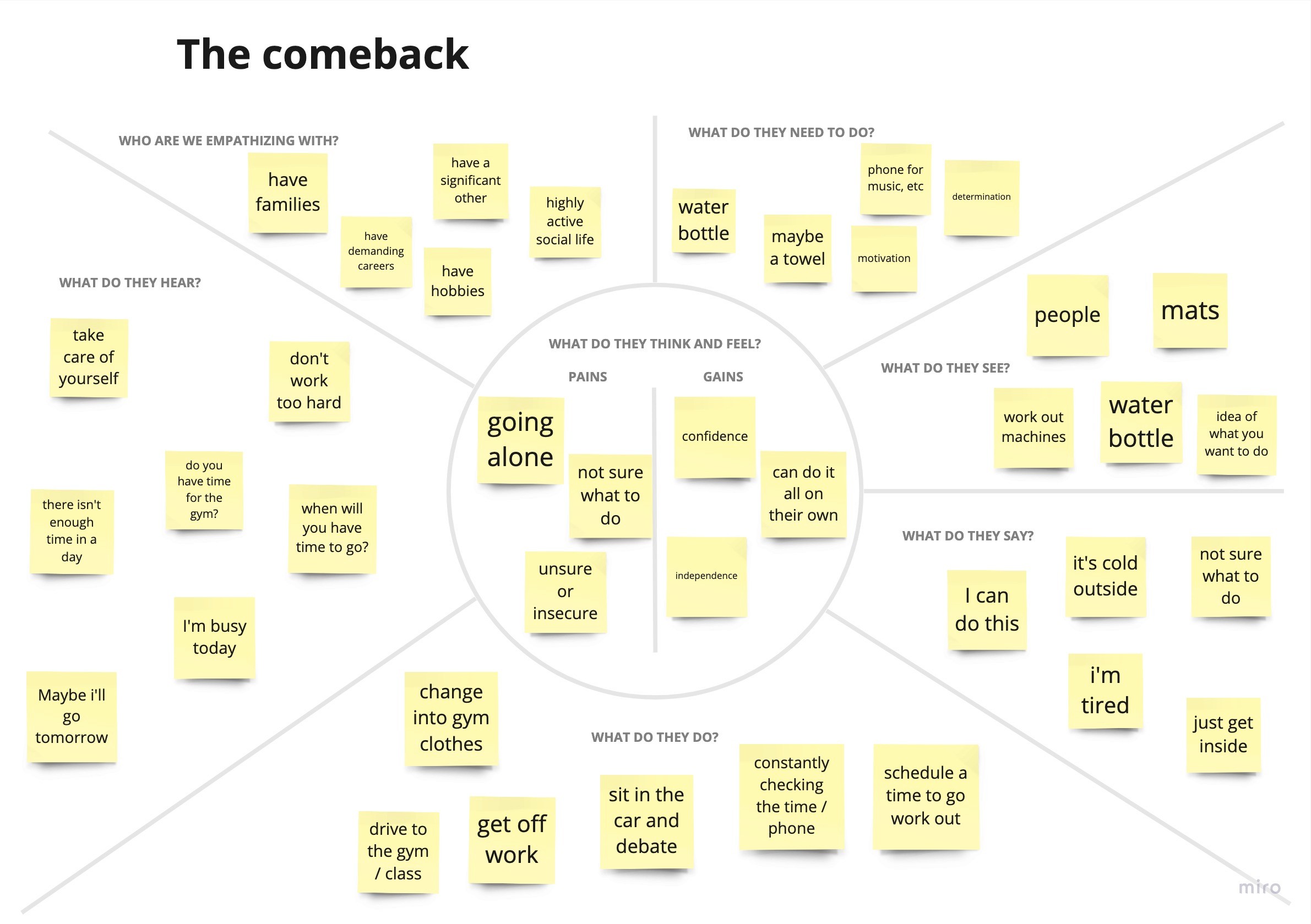
Primary: screener surveys → 1:1 interview → affinity maps → personas
Key themes from interviews: lack of motivation, limited foundational knowledge, uncertainity on where to start
Secondary: hard to follow workouts, unclear form guidance, fleeting motivation systems
Primary: screener surveys → 1:1 interview → affinity maps → personas
Key themes from interviews: lack of motivation, limited foundational knowledge, uncertainity on where to start
Four features shaped this design:
- muscle activation highlights to build form confidence
- workout variety to keep users engaged
- a reward system to reinforce consistency
- a calendar for routine building
"I look up videos or ask someone certified because I'm never sure if I'm doing it right — when there's no one to check my form, I just stop doing the exercise."
— Sarah K.
"I'll tell myself I'll do it tomorrow... I had a routine going for almost a year once, but after a few missed days it felt too hard to get back into."
— Kathy V.
72% of beginner gym-goers quit within the first 3 months due to lack of guidance, unclear progress, and low motivation.
Research Synthesis & Key Insights
Research Synthesis & Key Insights
After analyzing the survey, the issues were categorized into four main issues: variety workout, technique and form, staying motivated and routine building. This provided insight and highlighted the main issues that will need to be addressed when designing the app.
After analyzing the survey, the issues were categorized into four main issues: variety workout, technique and form, staying motivated and routine building. This provided insight and highlighted the main issues that will need to be addressed when designing the app.
Users get bored quickly with repetitive routines and need a range of exercises across muscle groups to stay engaged and look forward to working out.
Users lack confidence in whether they're performing exercises correctly. Without visual feedback or guidance, they stop doing exercises rather than risk injury.
Progress that isn't visible is progress that doesn't feel real. Users need acknowledgment of their consistency to stay committed and push through low-motivation days.
Getting back into a routine after a disruption feels overwhelming. Users need structure and a clear plan to follow so missing a day doesn't mean abandoning the habit entirely.
Ideation & Direction
Ideation & Direction
How might we motivate users to work out, equip them with the knowledge to exercise safely and confidently with proper form, and help them track their progress so they feel a sense of achievement toward their goals every day?
How might we motivate users to work out, equip them with the knowledge to exercise safely and confidently with proper form, and help them track their progress so they feel a sense of achievement toward their goals every day?

Site Map

User Flow
Design Rationale
Design Rationale
trainON's design targets three challenges from user research:
- limited exercise knowledge
- low motivation
- inconsistent routines.
It highlights targeted muscle groups to clarify proper form, uses a lightweight rewards system to reinforce progress, and offers calendar-based planning to build sustainable habits. Together, these features guide users at any stage of their fitness journey.
trainON's design targets three challenges from user research:
- limited exercise knowledge
- low motivation
- inconsistent routines.
It highlights targeted muscle groups to clarify proper form, uses a lightweight rewards system to reinforce progress, and offers calendar-based planning to build sustainable habits. Together, these features guide users at any stage of their fitness journey.
Sketches
Sketches
Sketches
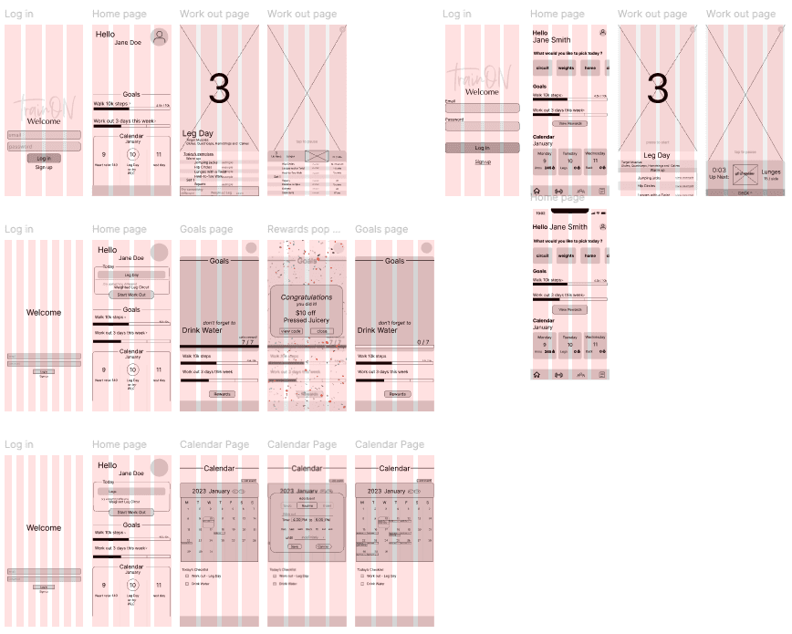
Wireframes V1
Wireframes V1
Wireframes V1
Style Guide
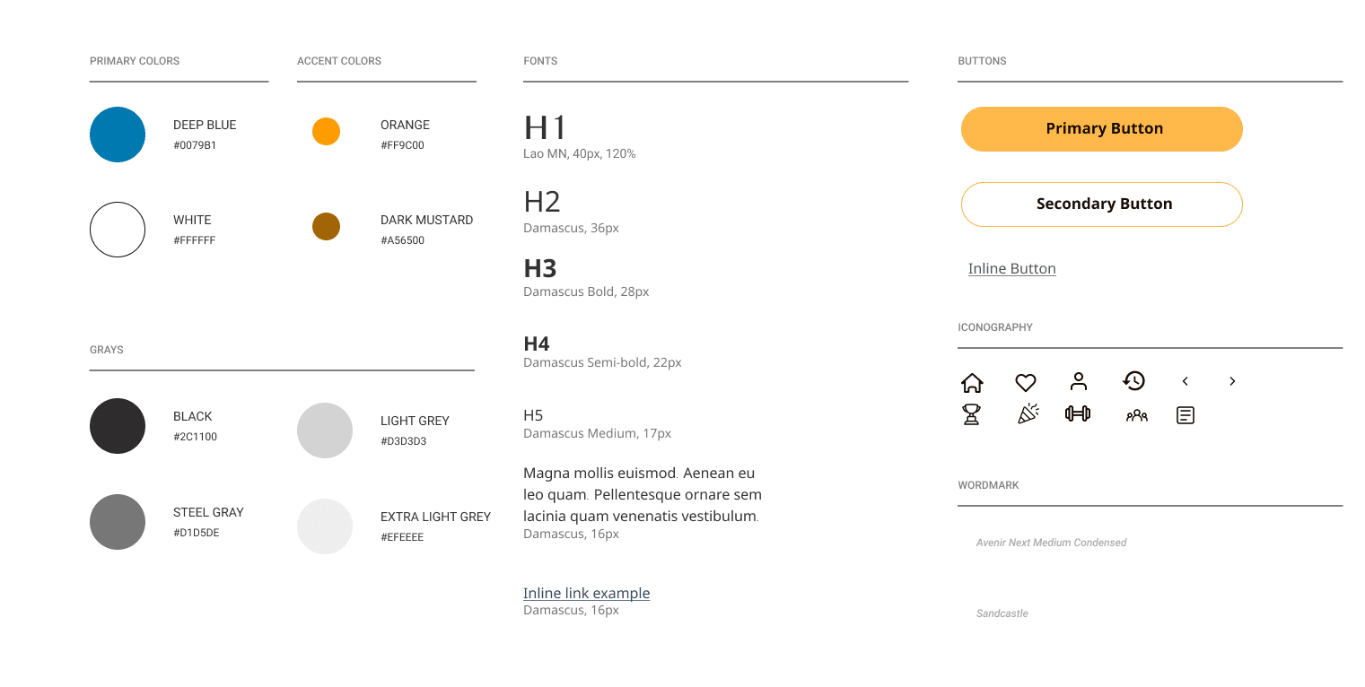
Style Guide
Style Guide
Fleshing it all out
Fleshing it all out
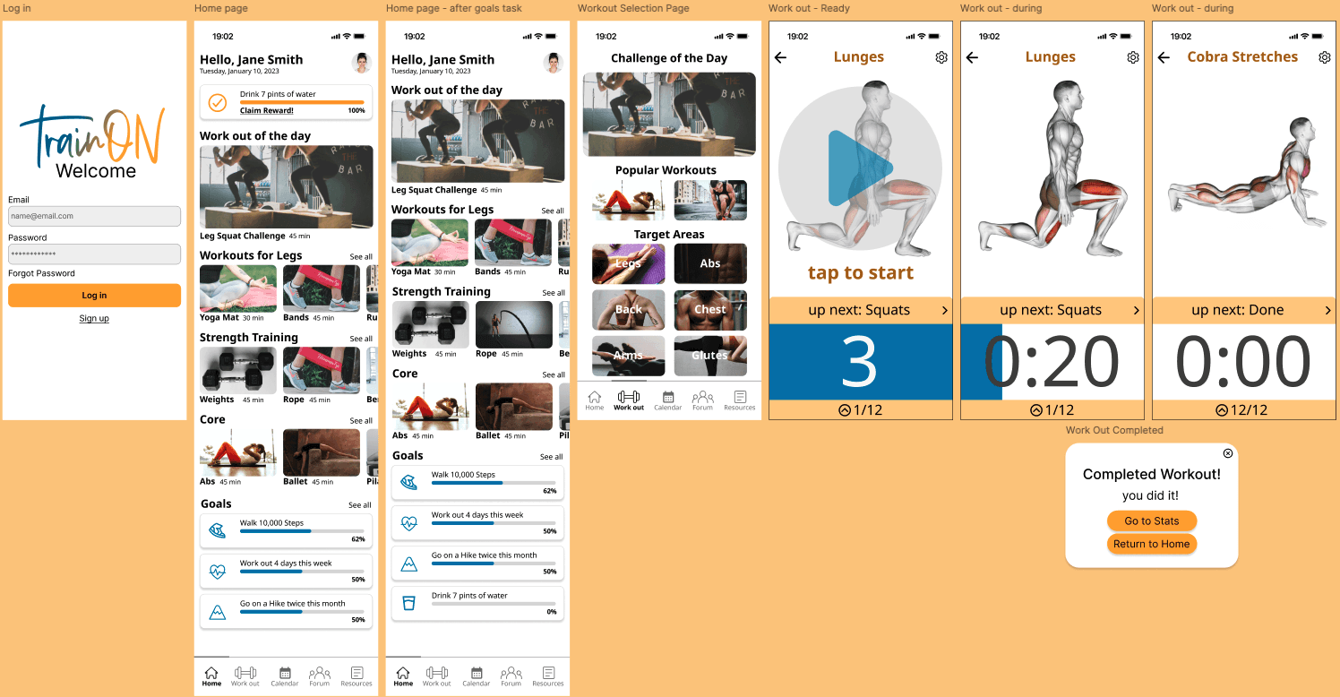
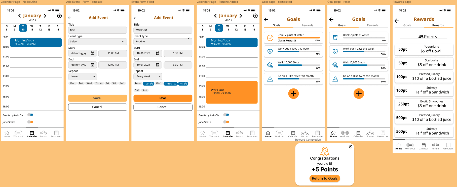
The goal of the app was to create a simple and effective app for users working towards a fitness goal. With multiple iterations, I made sure to reference my mood board and style guide to make sure my design aligned with the brand.
The goal of the app was to create a simple and effective app for users working towards a fitness goal. With multiple iterations, I made sure to reference my mood board and style guide to make sure my design aligned with the brand.
Prototype
Prototype
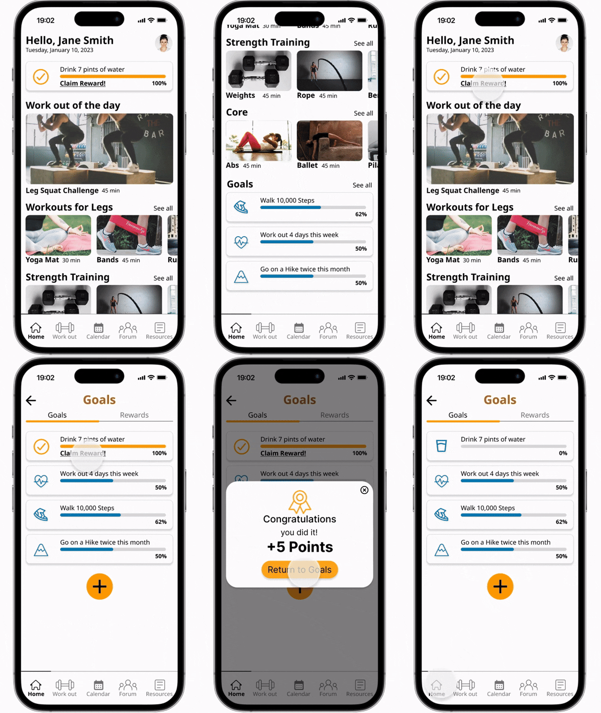
I built a high-fidelity prototype covering workout selection, guided exercises, and progress tracking to bring key user flows to life. This gave testers realistic interactions and helped validate core design decisions.
I built a high-fidelity prototype covering workout selection, guided exercises, and progress tracking to bring key user flows to life. This gave testers realistic interactions and helped validate core design decisions.

Usability Testing
Usability Testing
I ran usability testing with five participants, recruited through Slack and my personal network, in Zoom sessions. Each participant completed three key tasks while I observed their behavior and gathered feedback to identify areas for improvement.
Usability Pain Points
Usability Pain Points
I conducted a usability test to observe how users would approach and interact with my app and uncover issues that would need to be adjusted. I recruited five participants through Slack and my friends. While conducting the test through Zoom, participants were asked to complete 3 tasks and the main findings are listed below:
Findings #1: Navigation Bar
Task: Start a workout
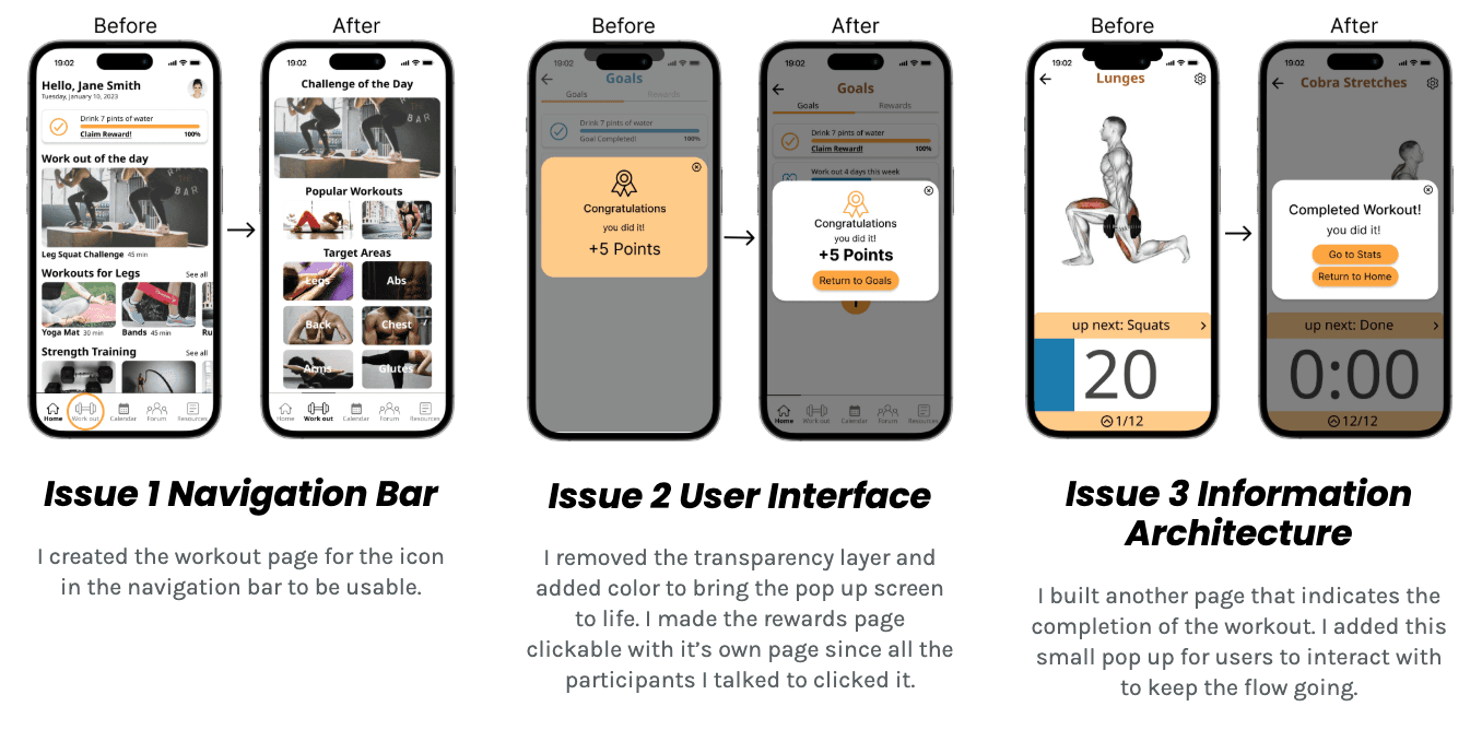
80% of users attempted to select the workout icon in the navigation bar at the start of the first task. After clicking, participants realized it is not usable and selected what was shown instead.
Findings #2: User Interface
Task: Claim the reward from the completed goal
3 of 5 users found the goals task to be confusing and dull. The pop up of completing the goal was underwhelming and the colors did not match the impression the page was supposed to give off.
Findings #3: Information Architecture
Task: Create a recurring event in Calendar
Several participants were confused and stuck when the task ended abruptly with no clear indication of where to go next. All users clicked around until the button was revealed of where they could go next.
I conducted a usability test to observe how users would approach and interact with my app and uncover issues that would need to be adjusted. I recruited five participants through Slack and my friends. While conducting the test through Zoom, participants were asked to complete 3 tasks and the main findings are listed below:
Findings #1: Navigation Bar
Task: Start a workout
80% of users attempted to select the workout icon in the navigation bar at the start of the first task. After clicking, participants realized it is not usable and selected what was shown instead.
Findings #2: User Interface
Task: Claim the reward from the completed goal
3 of 5 users found the goals task to be confusing and dull. The pop up of completing the goal was underwhelming and the colors did not match the impression the page was supposed to give off.
Findings #3: Information Architecture
Task: Create a recurring event in Calendar
Several participants were confused and stuck when the task ended abruptly with no clear indication of where to go next. All users clicked around until the button was revealed of where they could go next.
Takeaways
Takeaways
Ran my first end-to-end usability testing → learned that what feels obvious to the designer is rarely obvious to the user and confirmed the need to test assumptions rather than trust them
Iterated based on majority feedback instead of personal preference → made design decisions clearer and more purposeful, not reactive
Completed a full project from research to iteration → reinforced that good design comes from letting users lead the process
Ran my first end-to-end usability testing → learned that what feels obvious to the designer is rarely obvious to the user and confirmed the need to test assumptions rather than trust them
Iterated based on majority feedback instead of personal preference → made design decisions clearer and more purposeful, not reactive
Completed a full project from research to iteration → reinforced that good design comes from letting users lead the process